Through a class draw, they present us with the historical and technical investigation of a series of 4 typefaces that we can commonly find. Once this investigation has been carried out, we will select one of the fonts for the realization of a typographic specimen and poster in halftone.
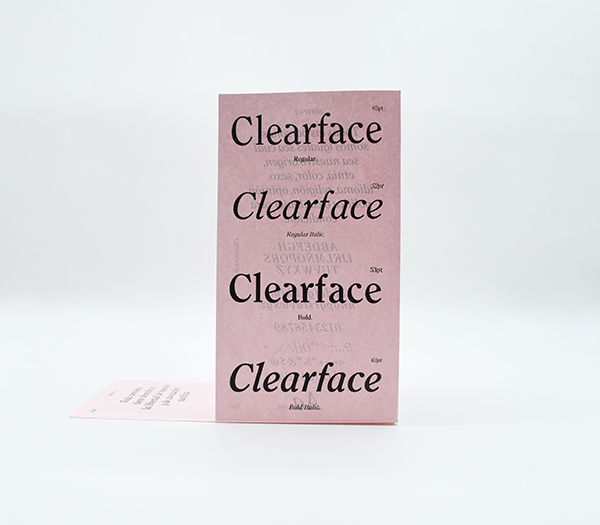
Our idea is based on a double page of the same scale of our research work so that once folded it keeps the same format, thus unifying the project. For our specimen, we’ll focus on four Cleareface weights: regular, italic, bold, and bolditalic. The entire printed project will be complemented by a pink support that will highlight the typographical stain of the monocolor project.
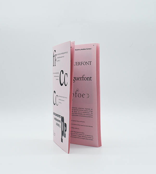
Our resulting specimen has a slight cut in the vertical part of the crease that makes this type of brochure a malleable product when folding or unfolding it. The social value of our term “Zeitgeist” appears in the running text examples offered, being these articles of the universal declaration of human rights.
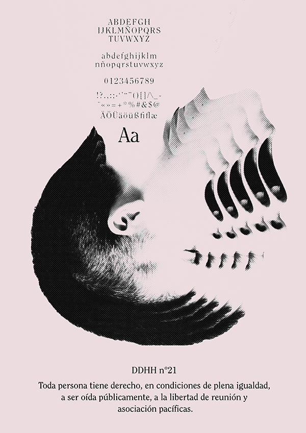
Taking advantage of the formats, a central fanzine of the four typefaces investigated is created. The idea of coherence of the entire project starts from the fanzine as the central axis, an individual specimen of each typeface and a poster. Thus, three unified supports would be offered. For our A3 poster a black and white rendition of the right to demonstrate is made using Cleareface Regular. The image created is a scream in its own right, the repetition of the composition is still a hyperbole of it.